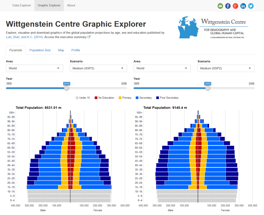
A few weeks ago a new version of the the Wittgenstein Centre Data Explorer was launched. The data explorer is intended to disseminate the results of a recent global population projection exercise which uniquely incorporates level of education (as well as age and sex) and the scientific input of more than 500 population experts around the world. Included are the projected populations used in the 5th assessment report of the Intergovernmental Panel on Climate Change (IPCC).
Over the past year or so I have been working (on and off) with the data lab team to create a shiny app, on which the data explorer is based. All the code and data is available on my github page. Below are notes to summarise some of the lessons I learnt:
1. Large data
We had a pretty large amount of data to display (31 indicators based on up to 7 scenarios x 26 time periods x 223 geographical areas x 21 age groups x 2 genders x 7 education categories)… so somewhere over 8 million rows for some indicators. Further complexity was added by the fact that some indicators were by definition not available for some dimensions of the data, for example, population median age is not available by age group. The size and complexity meant that data manipulations were a big issue. Using read.csv to load the data didn’t really cut the mustard, taking over 2 minutes when running on the server. The fantastic saves package and ultra.fast=TRUE argument in the loads function came to the rescue, alongside some pre-formatting to avoid as much joining and reshaping of the data on the server as possible. This cut load times to a couple of seconds at most, and allowed the app to work with the indicator variables on the fly as demanded by the user selections. Once the data was in, the more than awesome dplyr functions finished the data manipulations jobs in style. I am sure there is some smarter way to get everything running a little bit quicker than it does now, but I am pretty happy with the present speed, given the initial waiting times.
2. googleVis and gvisMerge
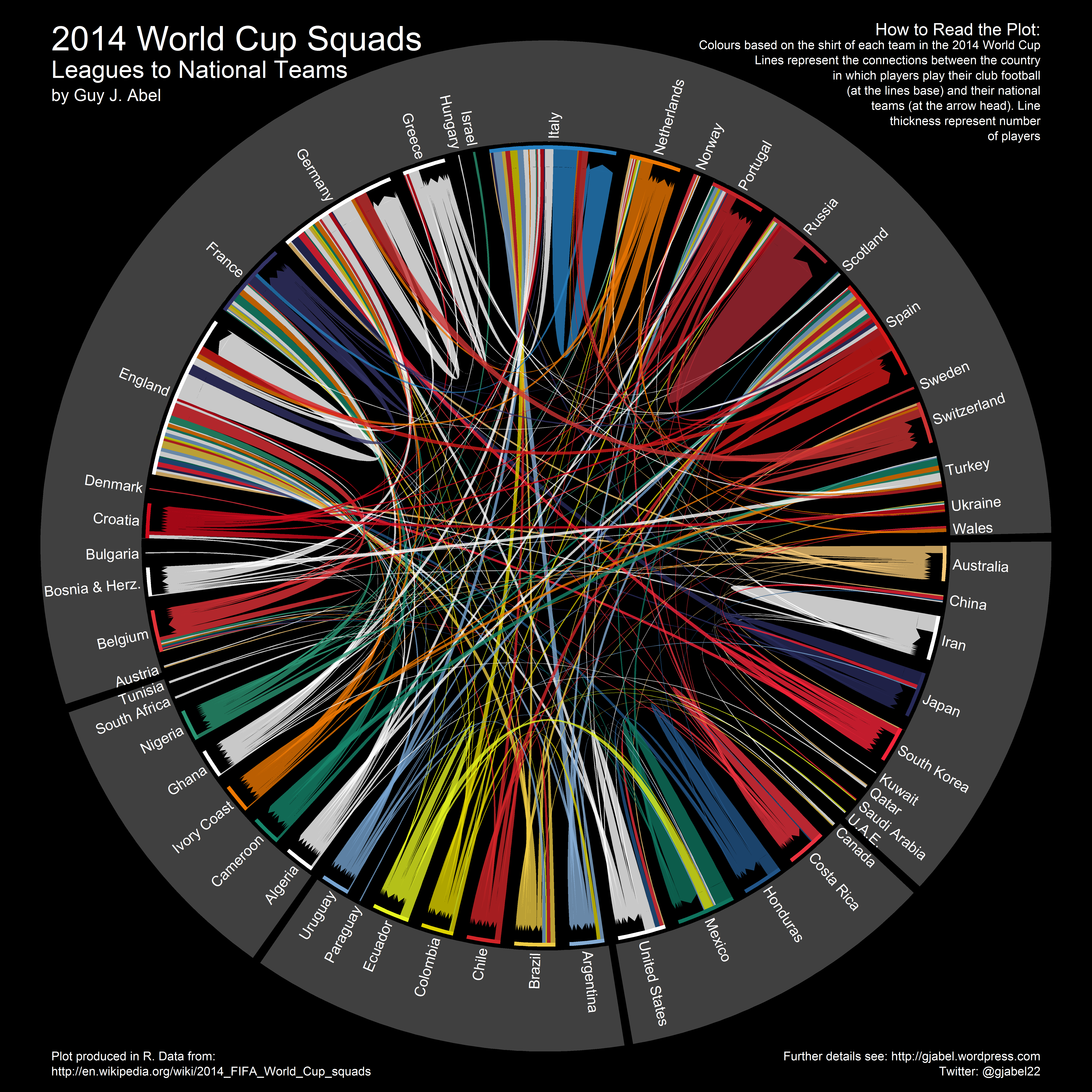
It’s a demographic data explorer, which means population pyramids have to pop-up somewhere. We needed pyramids that illustrate population sizes by education level, on top of the standard age and sex breakdown. Static versions of the education pyramids in the explorer have previously been used by my colleagues to illustrate past and future populations. For the graphic explorer I created some interactive versions, for side-by-side comparisons over time and between countries, and which also have some tool tip features. These took a little while to develop. I played with ggvis but couldn’t get my bar charts to go horizontal. I also took a look at some other functions for interactive pyramids but I couldn’t figure out a way to overlay the educational dimension. I found a solution by creating gender specific stacked bar charts from gvisBarChart in the googleVis package and then gvisMerge to bring them together in one plot. As with the data tables, they take a second or so render, so I added a withProgress bar to try and keep the user entertained.
I could not figure out a way in R to convert the HTML code outputted by the gvisMerge function to a familiar file format for users to download. Instead I used a system call to the wkhtmltopdf program to return PDF or PNG files. By default, wkhtmltopdf was a bit hit and miss, especially with converting the more complex plots in the maps to PNG files. I found setting --enable-javascript --javascript-delay 2000 helped in many cases.
3. The shiny user community
I asked questions using the shiny tag on stackoverflow and the shiny google group a number of times. A big thank you to everyone who helped me out. Browsing through other questions and answers was also super helpful. I found this question on organising large shiny code particularly useful. Making small changes during the reviewing process became a lot easier once I broke the code up across multiple .R files with sensible names.
4. Navbar Pages
When I started building the shiny app I was using a single layout with a sidebar and tabbed pages to display data and graphics (using tabsetPanel()), adding extra tabs as we developed new features (data selection, an assumption data base, population pyramids, plots of population size, maps, FAQ’s, etc, etc.). As these grew, the switch to the new Navbar layout helped clean up the appearance and provide a better user experience, where you can move between data, graphics and background information using the bar at the top of page.
5. Shading and link buttons
I added some shading and buttons to help navigate through the data selection and between different tabs. For the shading I used cssmatic.com to generate the colour of a fluidRow background. The code generated there was copy and pasted into a tags$style element for my defined row myRow1, as such;
library(shiny)
runApp(list(
  ui = shinyUI(fluidPage(
    br(),
    fluidRow(
      class = "myRow1",
      br(),
      selectInput('variable', 'Variable', names(iris))
    ),
    tags$style(".myRow1{background: rgba(212,228,239,1);
                background: -moz-linear-gradient(left, rgba(212,228,239,1) 0%, rgba(44,146,208,1) 100%);
                background: -webkit-gradient(left top, right top, color-stop(0%, rgba(212,228,239,1)), color-stop(100%, rgba(44,146,208,1)));
                background: -webkit-linear-gradient(left, rgba(212,228,239,1) 0%, rgba(44,146,208,1) 100%);
                background: -o-linear-gradient(left, rgba(212,228,239,1) 0%, rgba(44,146,208,1) 100%);
                background: -ms-linear-gradient(left, rgba(212,228,239,1) 0%, rgba(44,146,208,1) 100%);
                background: linear-gradient(to right, rgba(212,228,239,1) 0%, rgba(44,146,208,1) 100%);
                filter: progid:DXImageTransform.Microsoft.gradient( startColorstr='#d4e4ef', endColorstr='#2c92d0', GradientType=1 );
                border-radius: 10px 10px 10px 10px;
                -moz-border-radius: 10px 10px 10px 10px;
                -webkit-border-radius: 10px 10px 10px 10px;}")
  )),
  server = function(input, output) {
  }
))
I added some buttons to help novice users switch between tabs once they had selected or viewed their data. It was a little tougher to implement than the shading, and in the end I need a little help. I used bootsnipp.com to add some icons and define the style of the navigation buttons (using the tags$style element again).
That is about it for the moment. I might add a few more notes to this post as they occur to me… I would encourage anyone who is tempted to learn shiny to take the plunge. I did not know JavaScript or any other web languages before I started, and I still don’t… which is the great beauty of the shiny package. I started with the RStudio tutorials, which are fantastic. The R code did not get a whole lot more complex than what I learnt there, even though the shiny app is quite large in comparisons to most others I have seen.
Any comments or suggestions for improving website are welcome.